
Customize Your GogoPogo Store Layout and Theme
Designing your storefront is one of the most important parts of setting up your GogoPogo store. In this guide, you’ll learn how to customize your store layout, theme, and overall design to make it visually appealing and user-friendly.
Step 1: Access Site Design via Dashboard
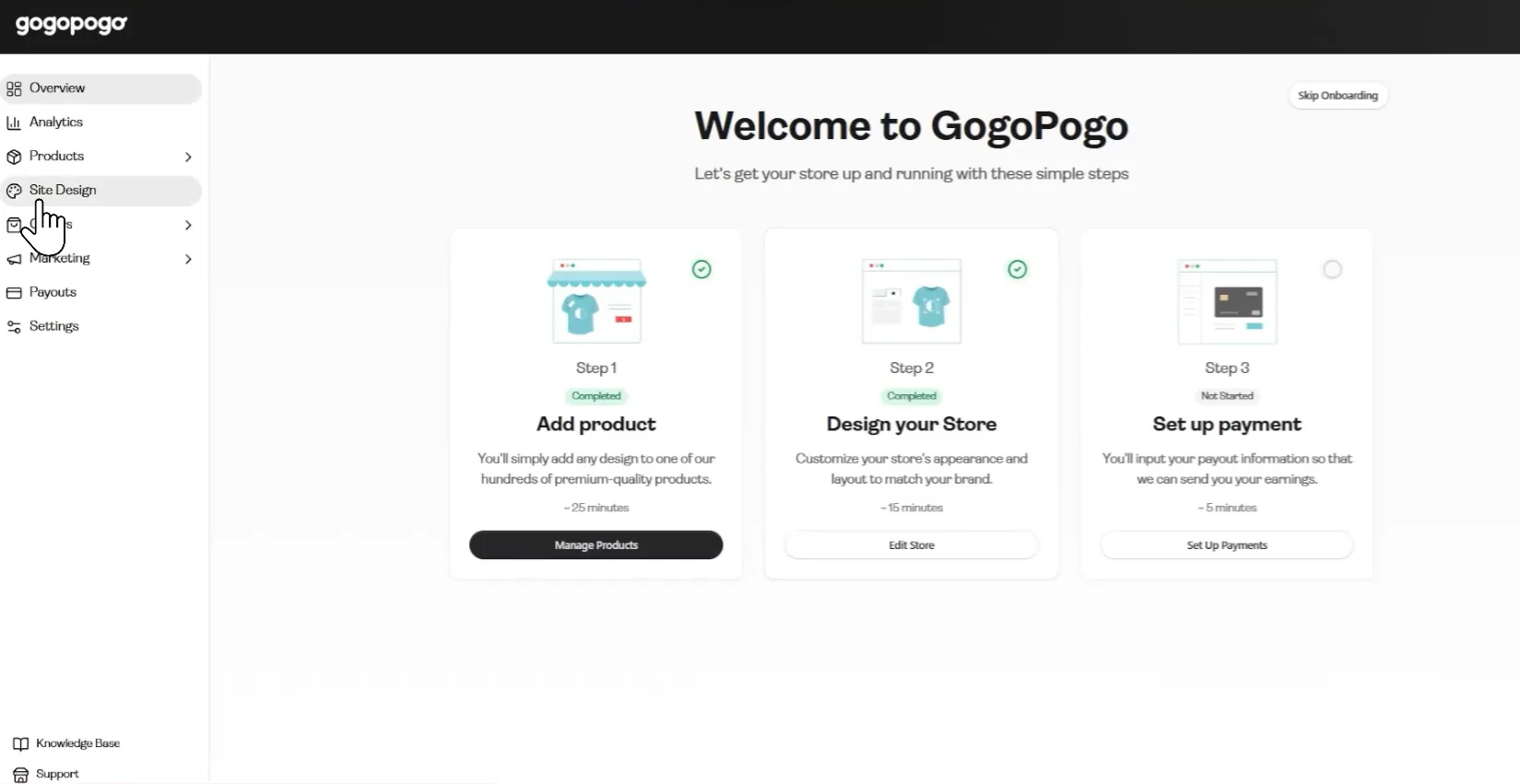
Section titled “Step 1: Access Site Design via Dashboard”After logging into your GogoPogo dashboard, move your cursor to the left-side navigation panel.
Click on “Site Design”
Step 2: Enter the Store Editor
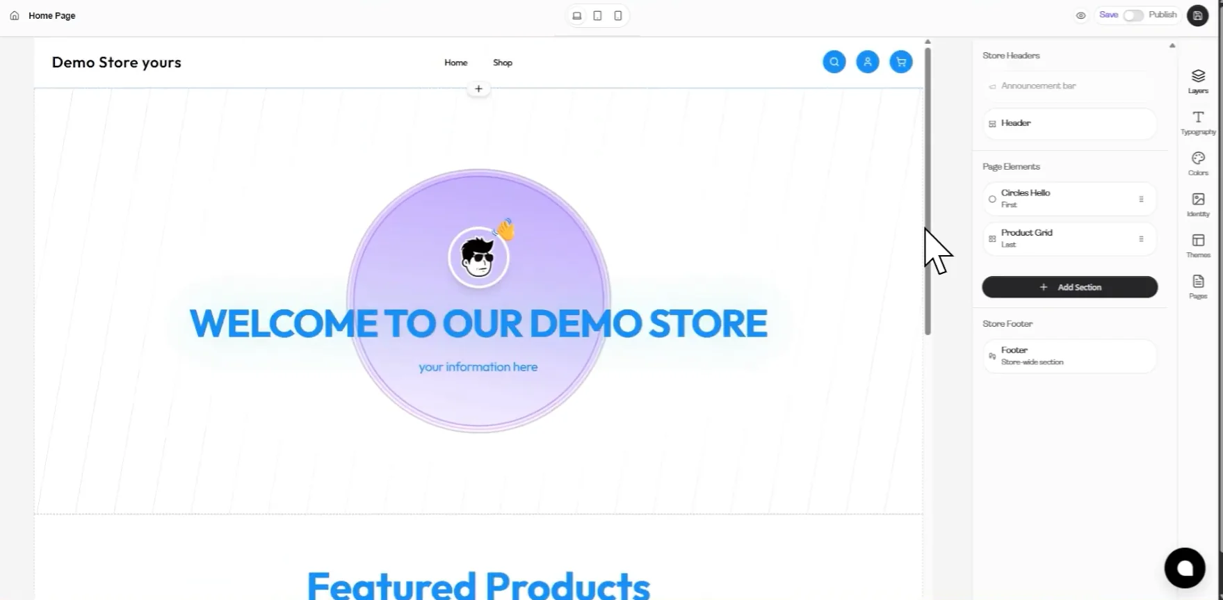
Section titled “Step 2: Enter the Store Editor”Once you click “Site Design,” the storefront editor will open.
This editor includes:
- Live preview of your store (center)
- Customization panel (right side)
- Navigation tools (top)
Step 3: Explore And Apply Pre-Built Themes
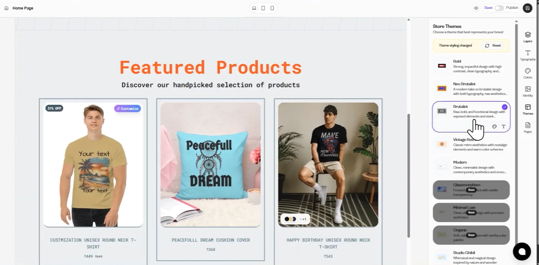
Section titled “Step 3: Explore And Apply Pre-Built Themes”On the right side panel, you’ll find Themes. As soon as you click on it, the “Store Themes” panel will open on the right side of the screen.
You can:
- Browse available themes
- Preview layouts
- Apply a theme to your store
Scroll through different themes and select one.
After selecting a theme:
- Your store preview updates instantly
Step 4: Customize Store Colors
Section titled “Step 4: Customize Store Colors”After applying your selected theme, move your cursor to the right-side vertical navigation panel (where options like Layers, Typography, Colors, etc. are present).
Locate the “Colors” option (color palette icon) and left-click on it.
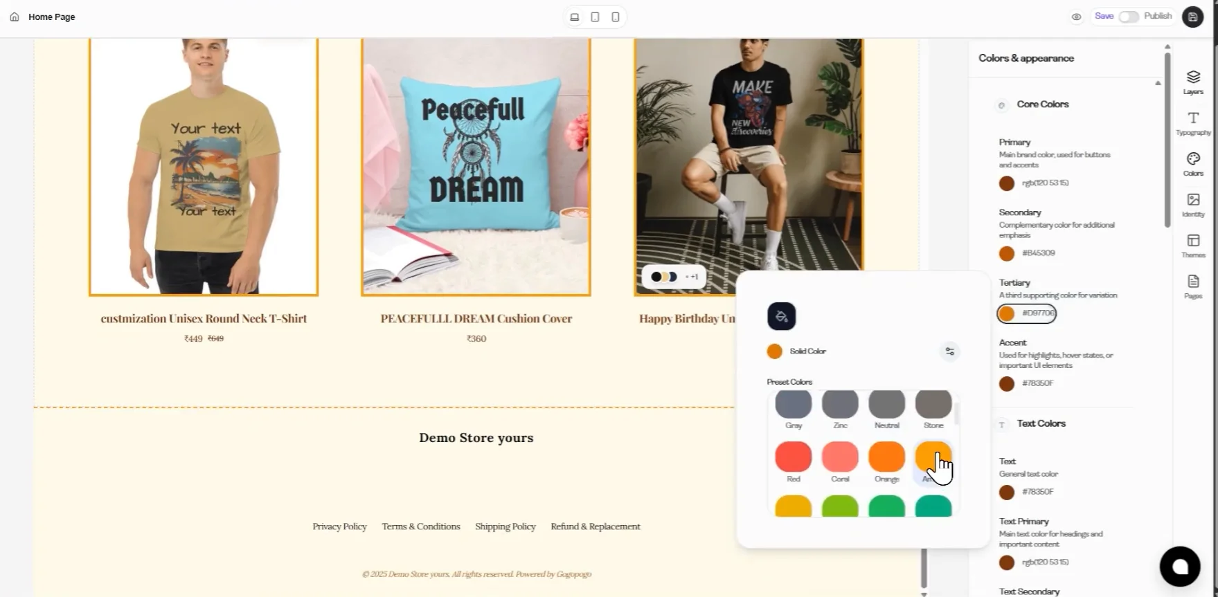
As soon as you click, the “Colors & appearance” panel will open on the right side of the screen.
Inside this panel, find the “Core Colors” section, where you will see options like:
- Primary
- Secondary
- Tertiary
- Accent
Now, move your cursor to the color circle next to any option (for example, Primary) and click on it.
This action will open the color picker popup.
From the popup, select any color from the preset color options (such as orange).
Once you click on a color, it will be applied instantly to your store, and you can observe the changes in the store preview section in the center.
Step 5: Open Layers Panel
Section titled “Step 5: Open Layers Panel”Move your cursor to the right-side navigation panel and click on “Layers.”
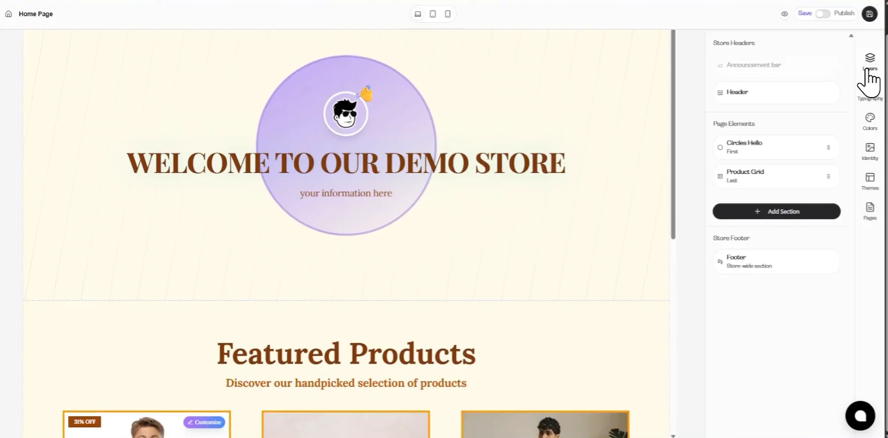
Once clicked, the Layers panel will open, showing three main sections:
- Store Headers
- Page Elements
- Store Footer
Step 6: Page Elements Customization
Section titled “Step 6: Page Elements Customization”Use the Page Elements section to add, manage, and customize different sections of your store layout.
Add New Sections
Section titled “Add New Sections”To add more sections to your store:
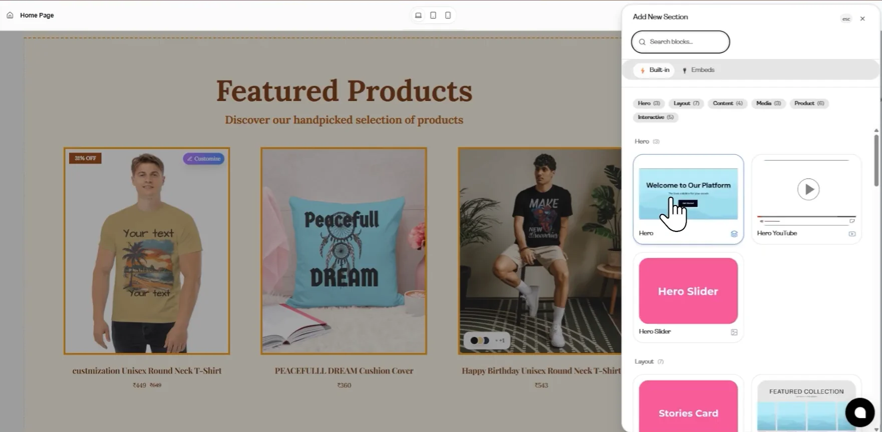
Click on “+ Add Section.” As soon as you click, the “Add New Section” panel will open on the right side of the screen.
A list of available sections will appear, including:
- Hero Slider
- Hover Cards
- Image Link
- Product Grid and many more
Select any section to add it to your page.
Use Section Options (Hide/Delete)
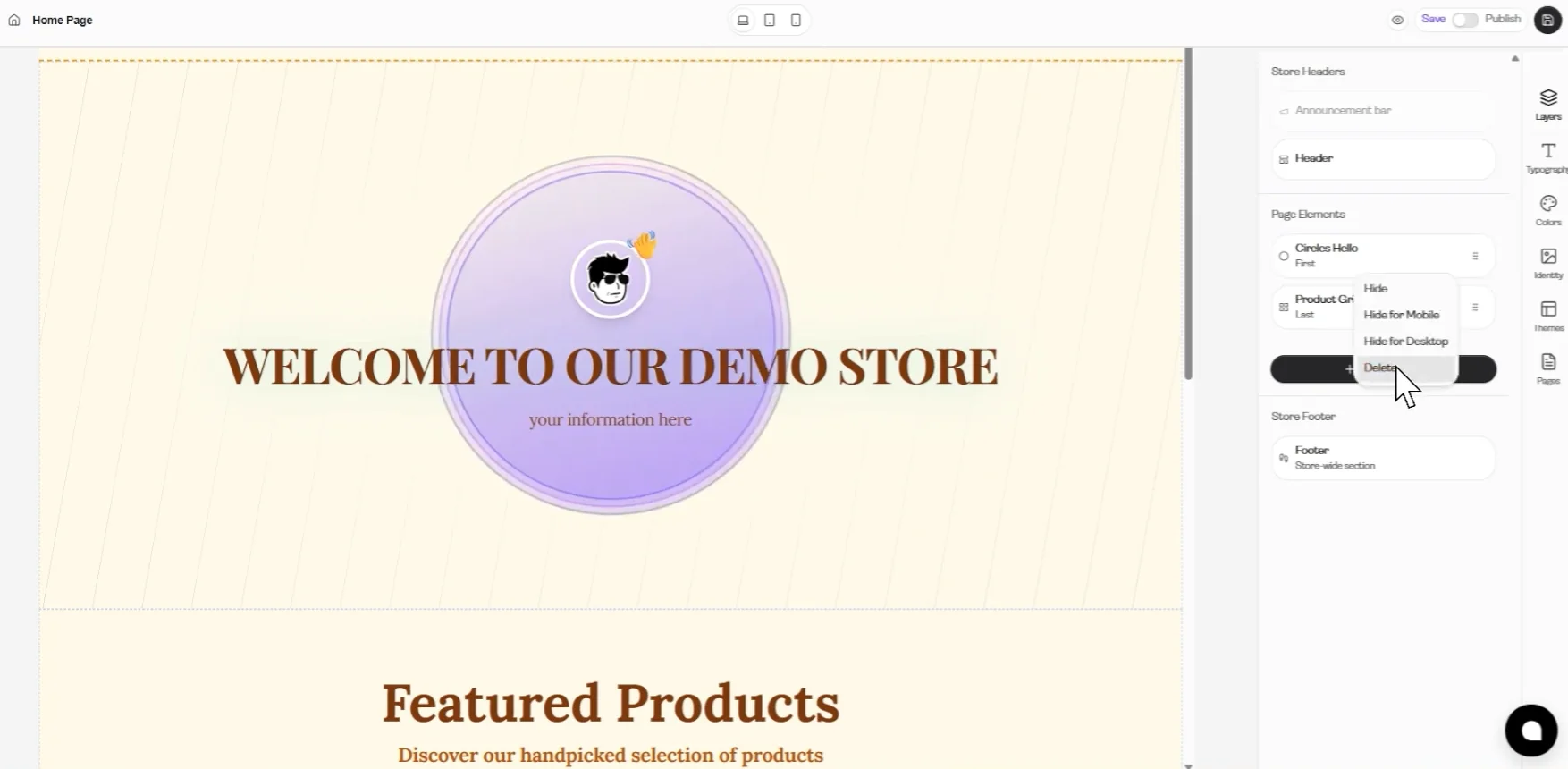
Section titled “Use Section Options (Hide/Delete)”Next to each section, click on the three-dot menu (⋮).
From here, you can:
- Hide the section
- Hide for Mobile/Desktop
- Delete the section
Customize Selected Sections
Section titled “Customize Selected Sections”Click on any section (like Hero Slider, Hover Cards, Image Link, etc) from Page Elements.
This will open the customization panel on the right side, where you can:
- Edit content
- Change layout and arrangement
- Update images and text
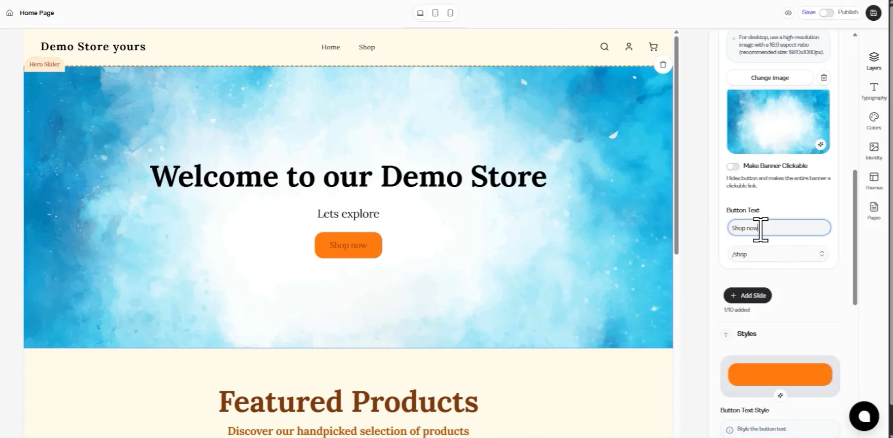
The interface shown here belongs to the Hero Slider section 👆
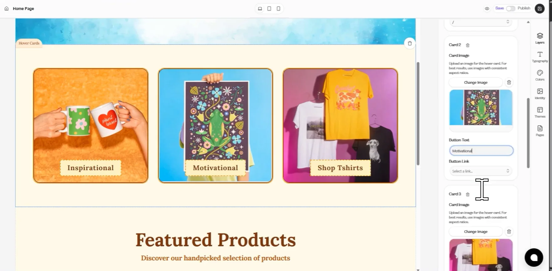
The interface shown here belongs to the Hover Cards section 👆
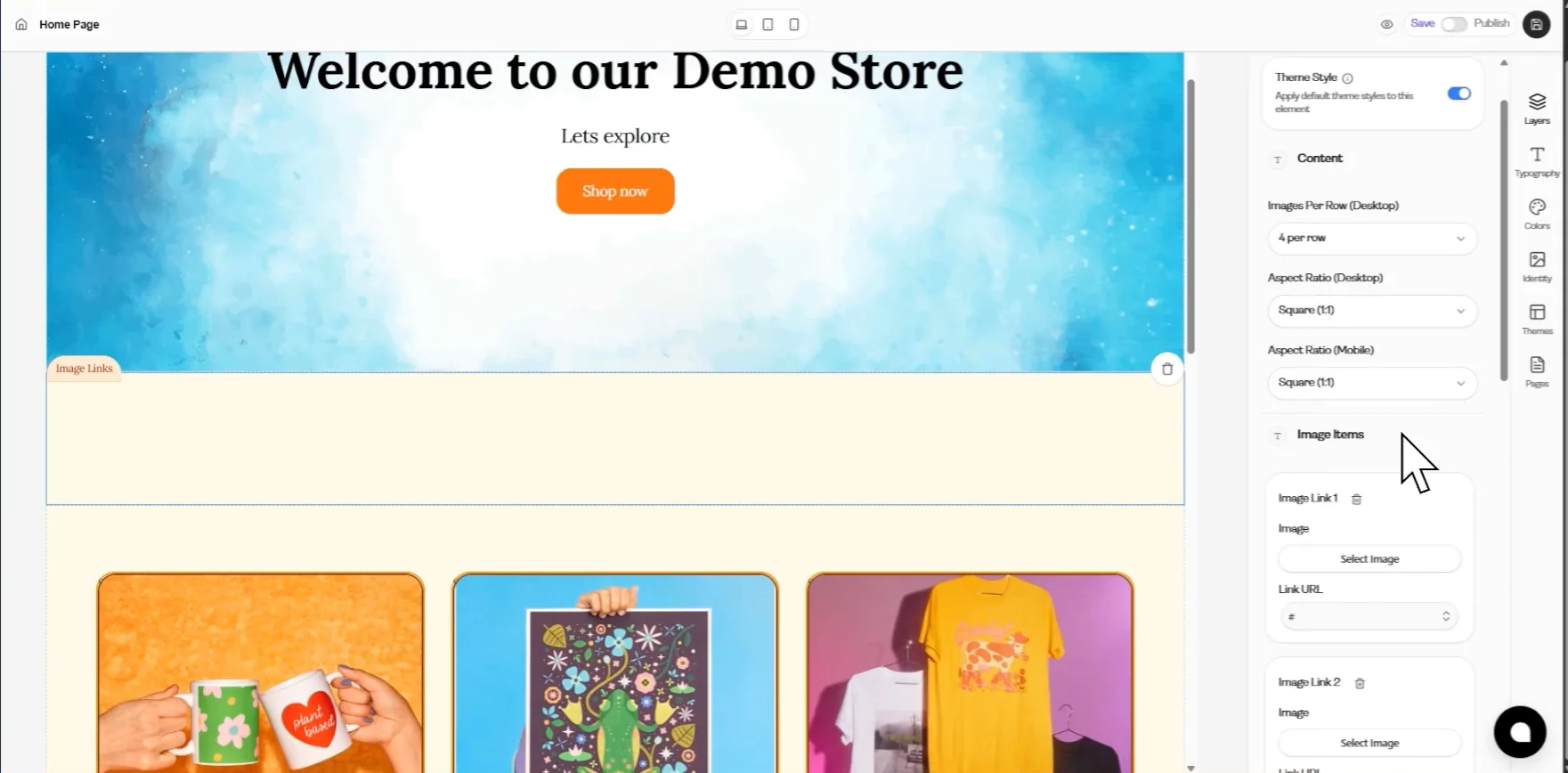
The interface shown here belongs to the Image Link section 👆
Step 7: Store Headers Customization
Section titled “Step 7: Store Headers Customization”Customize the top part of your store, including announcements and navigation.
Edit Announcement Bar
Section titled “Edit Announcement Bar”Now, scroll to the Store Headers section at the top of the Layers panel.
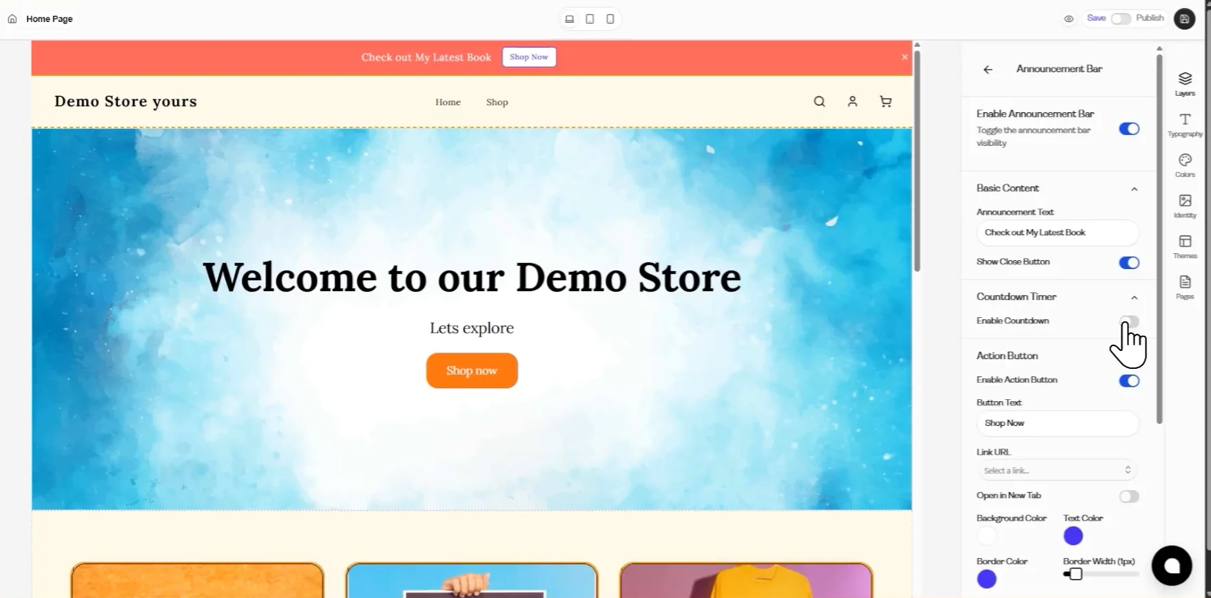
Click on “Announcement bar”.
Then:
- Click on Edit and thenEnable Announcement Bar.
- The settings panel will open
Here, you can:
- Enable/disable the announcement bar
- Edit the announcement text
- Customize its style and appearance
Customize Header (Logo & Navigation)
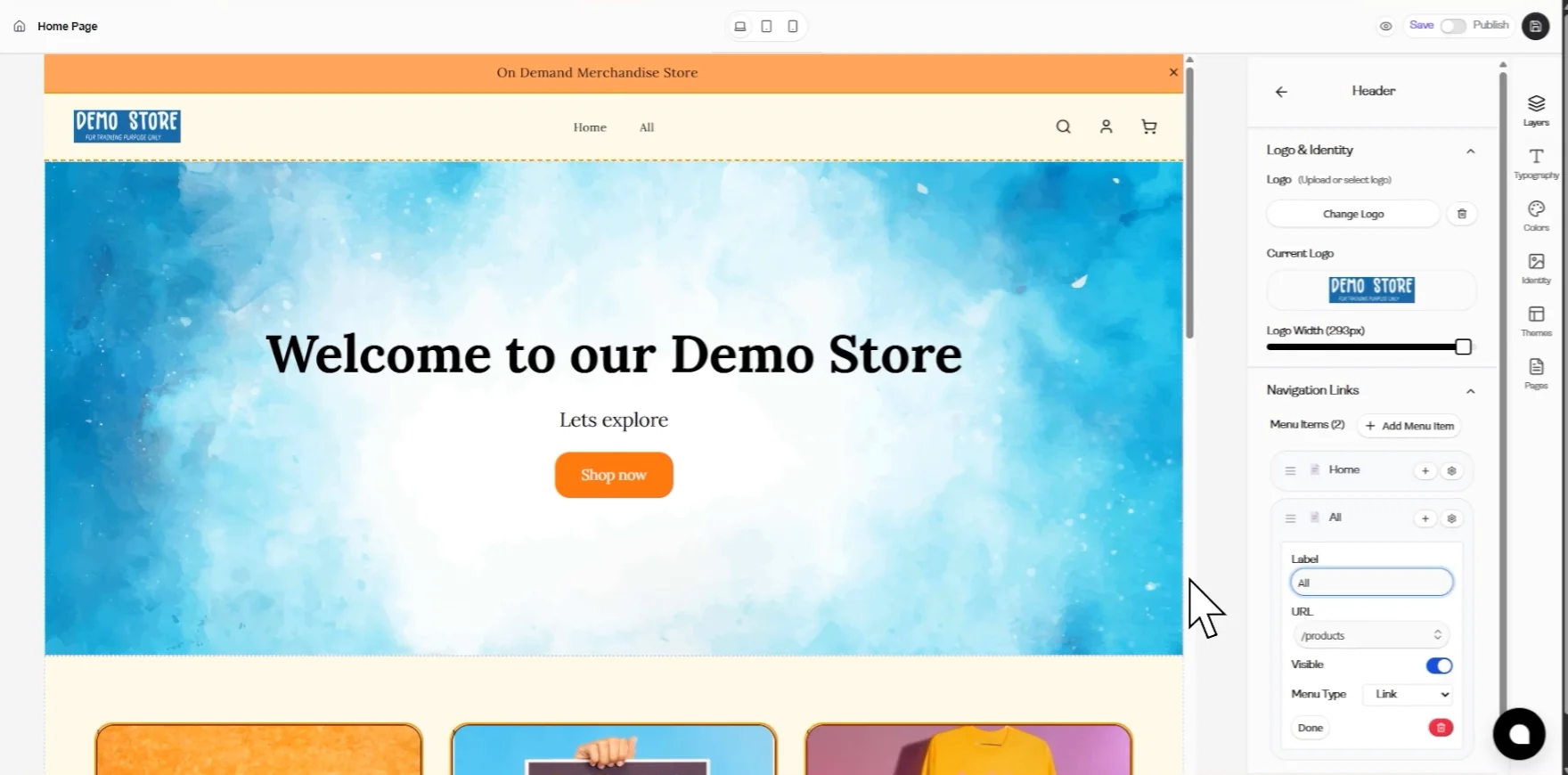
Section titled “Customize Header (Logo & Navigation)”Under the Store Headers section (below the Announcement Bar), click on “Header.”
Here, you can adjust:
- Logo & Identity
- Navigation Links
Step 8: Store Footer Customization
Section titled “Step 8: Store Footer Customization”Customize the bottom section of your store with layout, links, and social platforms.
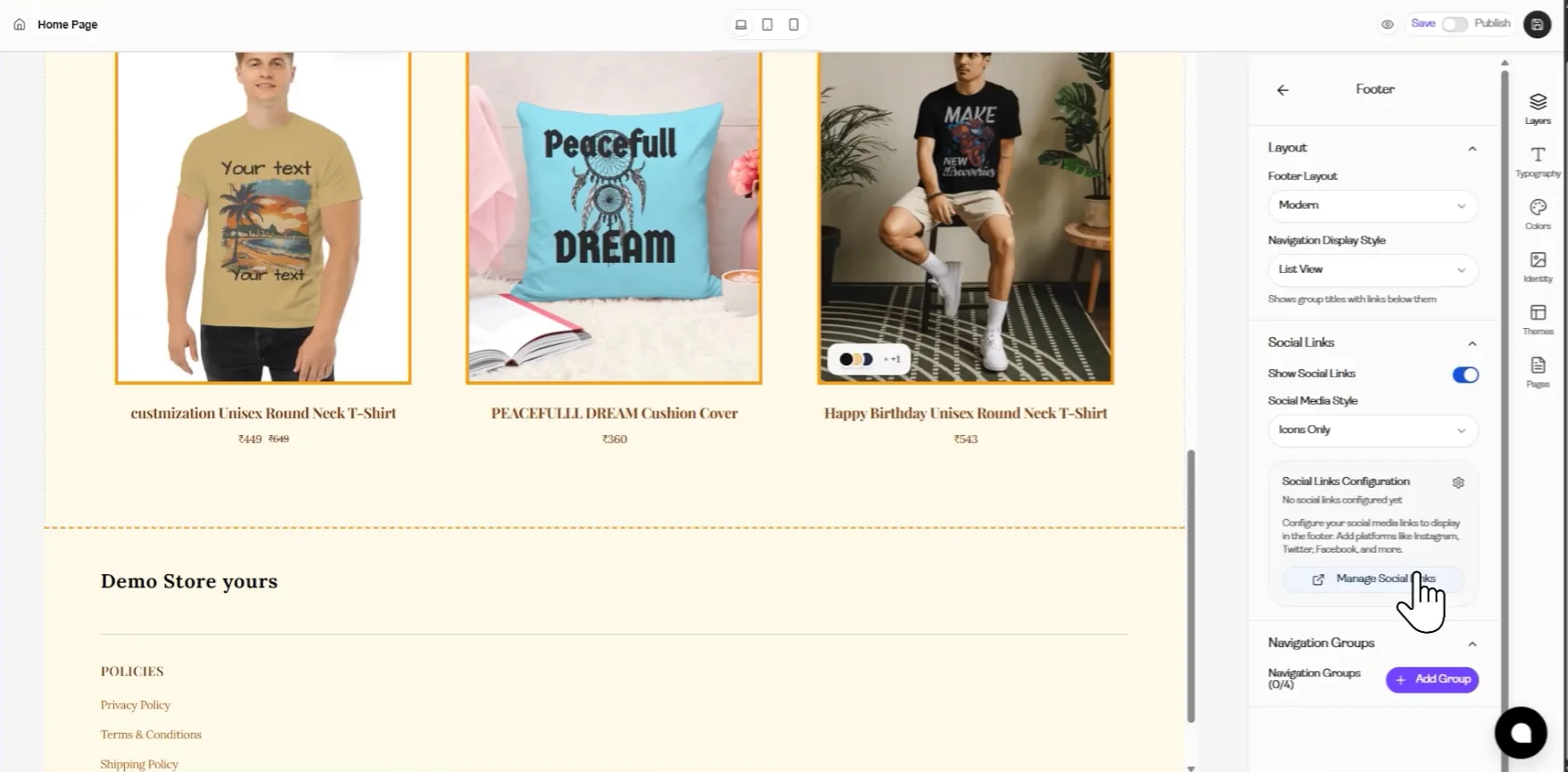
Customize Footer Settings
Section titled “Customize Footer Settings”After editing the Header Section, move to the Store Footer section in the Layers panel.
Click on “Footer”. Once selected, the footer customization panel will open on the right side.
Here, you can adjust:
- Footer Layout – control the overall structure
- Navigation Display Style – manage how links appear
- Navigation Row – arrange footer links
Under Social Links:
- Add platforms like:
- Enter your profile link/handle (e.g., Instagram URL)
Button Settings:
- Enable or disable buttons
- Customize button style and appearance
All changes will be instantly visible in the store preview
Step 9: Use Section Controls from Preview
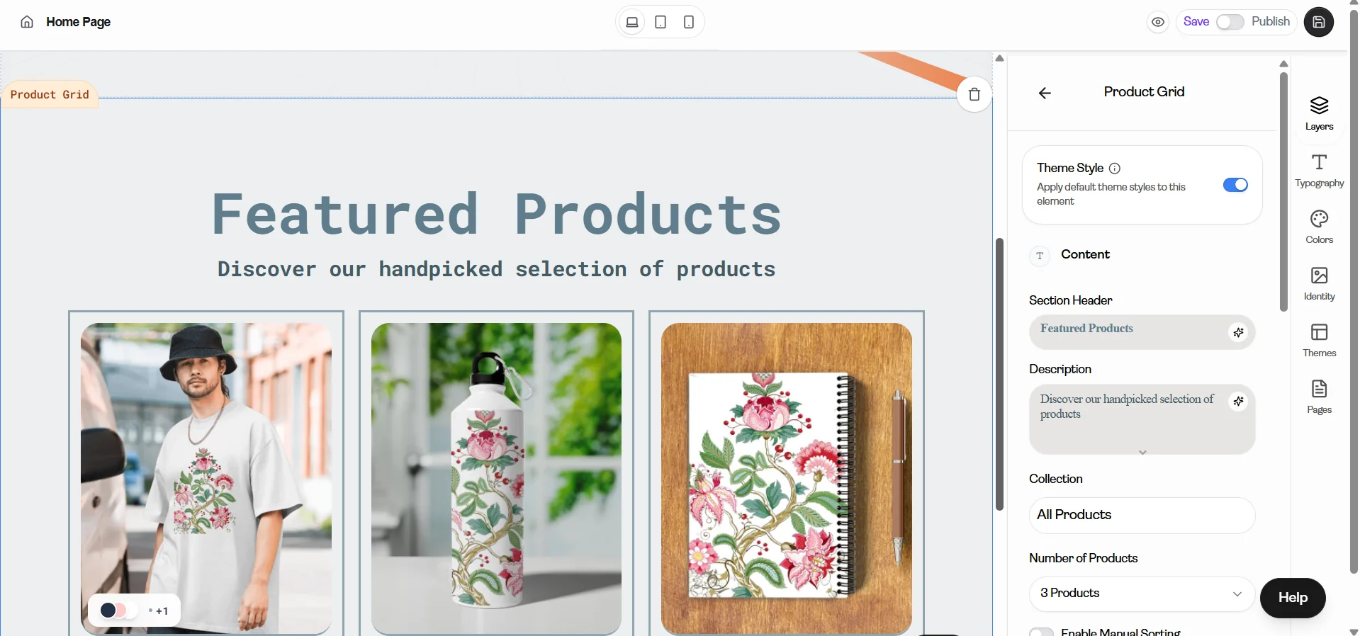
Section titled “Step 9: Use Section Controls from Preview”In the store editor, click on any section in the preview area (for example, top section like Wrap Hello or bottom section like Product Grid).
When you click on a section:
- The customization panel opens on the right side
- A delete icon (🗑️) appears on the selected section
From here, you can:
- Edit the selected section using the right-side panel
- Click on the delete icon (🗑️) to remove the section
Step 10: Save & Publish Your Store
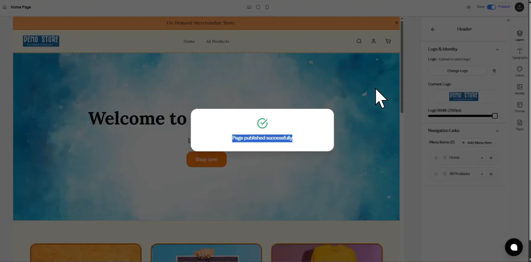
Section titled “Step 10: Save & Publish Your Store”After completing all your customizations, click on “Save”.
Then click on “Publish”.
Once published, a confirmation message will appear showing that your store has been published successfully.
Step 11: Preview Your Store on Different Devices
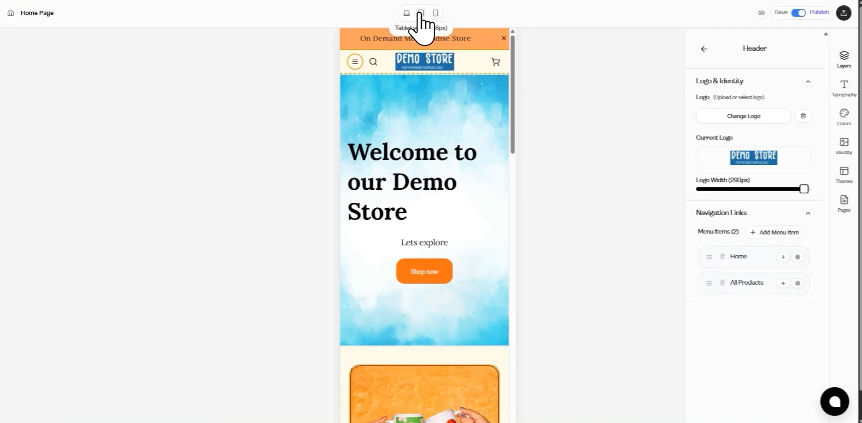
Section titled “Step 11: Preview Your Store on Different Devices”At the top of the editor, locate the “Homepage” bar.
Next to it, you will see three preview icons.
These represent:
- First icon → Desktop view
- Second icon → Tablet view
- Third icon → Mobile view
Click on each icon to preview how your store looks on different screen sizes.
This helps you:
- Check responsiveness
- Ensure proper alignment
- See how content adjusts on different devices
By following these steps, you can fully customize your GogoPogo store to look professional and appealing. The key is to experiment with themes and sections while keeping your design simple and user-friendly.